 Here is Portales de Chascomus #2.
Also painted on sanded paper mounted on foam core, measuring 30 x 40 cm.
Here is Portales de Chascomus #2. Painting a "series" is fun and interesting.
 In mid February I attended a workshop on Portraiture with Dianna Ponting, and here is the result.
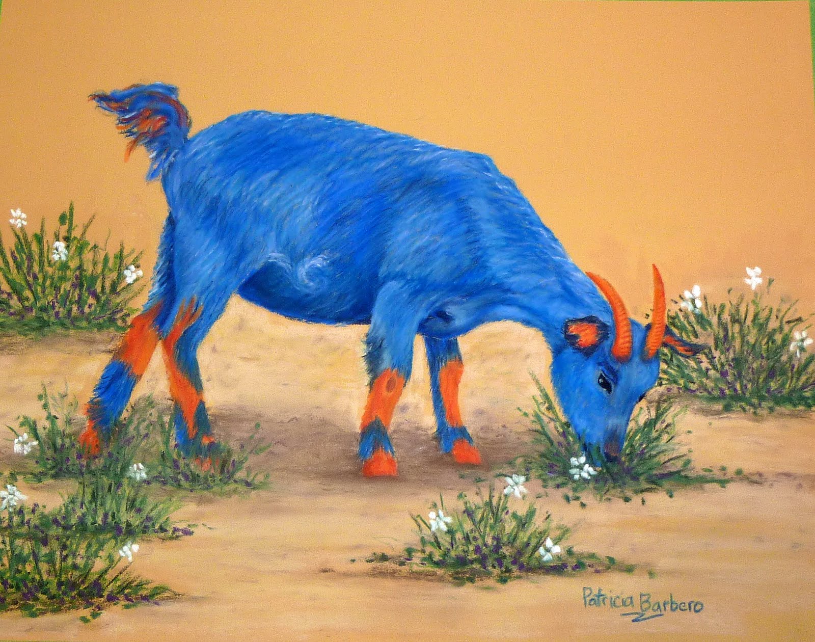 Meet Rosie, the newest addition to the funny farm.
 Meet Harry, a Pig with a Purpose.


 An orange sheep? Sure! Why not?
 There are many ways to learn to paint: from books, videos, regular classes, workshops, to name a few.