Sunday, March 20, 2011

Italian Town


This is my first "big" painting, the largest I have worked on so far.

I have a fondness for medieval towns, they feel so "organic" to me. Spontaneous and unplanned, they grow out of the hillsides at a very human scale, that excludes cars and other modern contraptions. The narrow winding roads, made for people, carts, horses (and the occasional herd of sheep), and the houses that give them shape growing out of the ground at angles that make drawing perspective a nightmare.

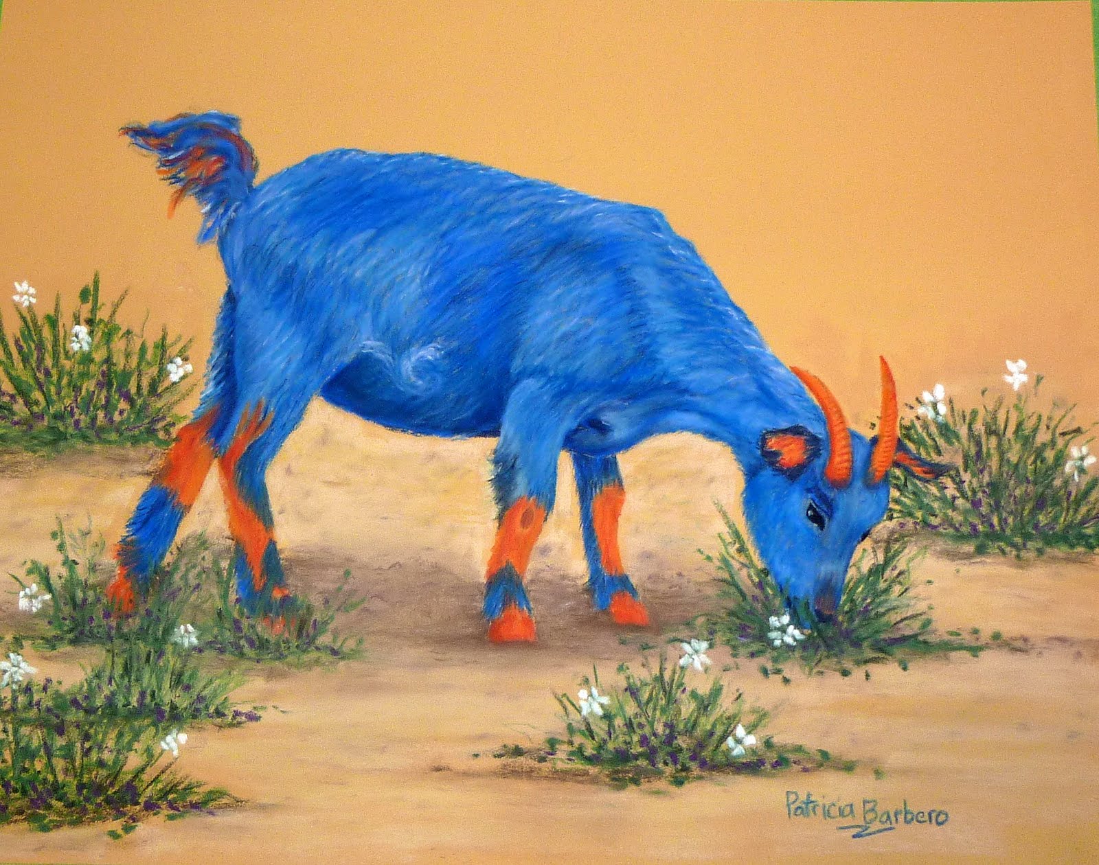
I created this painting on PastelMat, using soft pastels. It measures 0.5m x 0.7m.

Girl with Orange Hat - portraiture workshop

In mid February I attended a workshop on Portraiture with Dianna Ponting, and here is the result.
It was a very interesting class, with great people and a super teacher. Lots of learning, at many levels.

I can't take full credit for this painting as Dianna helped quite a bit, her intent being to send you home with something you co-created that can be used as reference material for future works.

A great class, I recommend it to anyone. I wish I was going with Dianna to Europe (specially Greece) for her workshops on plain-aire painting...

It is painted on suede board with soft pastels and measures 0.41 x 0.51m

The Funny Farm keeps growing

Meet Rosie, the newest addition to the funny farm.

It is painted on PastelMat with soft pastels and measures 0.3 x 0.24m

Monday, November 22, 2010

More fun with complementary colours

Meet Harry, a Pig with a Purpose.
He is part of my growing "funny farm" which includes so far 3 sheep and this pig.
Watch for coming attractions: goats, chickens, ducks, pigs. All in fabulous and fashionable complementary colours.
Art doesn't have to be so serious; some fun is allowed and encouraged.

It is painted on PastelMat with soft pastels and measures 0.3 x 0.24m

Friday, November 12, 2010

Underpainting with complementary colours


In this piece I started by using complementary colours throughout the whole painting, maintaining the values in the original reference photo (I used a black and white photocopy to help me see the values better).
So, the sky was different shades of orange, as was the water. The building was green, the shadows were yellow.

The white parts of the clouds were... white. White is not a color - it is light, it has no complementary. Black is not a colour - it is absence of light, it has no complementary either.
When I finished the complementary underpainting, it looked very "interesting", like a Mars landscape... (a "Marscape"?)
So I went back and applied the "real" colour on top, and voila! we are back on Earth - Peggy's Cove, to be precise.

Using complementary colours as an underpainting to a landscape theme adds luminosity to it.
It is painted on sandpaper with soft pastels and measures 0.3 x 0.46m.

Fun with Complementary colours


An orange sheep? Sure! Why not?

Complementary colours sit opposite each other on the colour wheel and "call each other out" to play, they add vibrancy to a painting.

They are pairs of a primary colour (red, yellow and blue) and a secondary colour that does not contain it.
As in: orange (yellow + red) and blue; green (yellow + blue) and red; purple (blue + red) and yellow.
In these examples the colour of the sheep is complementary to the colour of the backgound.
The orange sheep is in a private collection.

Sunday, September 5, 2010

Refreshing your creative spark


Right after I finished this piece I took a vacation from pastel painting and going to painting classes, and choose instead to attend a Raku pottery class.
What a great idea! I had a blast! Working in 3D changed the way I look at things and gave me a new perspective. The process of working with clay and firing the Raku pieces was magical. "Its like a box of chocolates, you never know what you're going to get...". Anyway, I had some clay left over and I've been working in the garage making all sorts of interesting things to fire Raku style (and taking care of my Christmas list in the process). I managed to get this one framed, though, and it looks good.

Saturday, July 10, 2010

Taking classes

There are many ways to learn to paint: from books, videos, regular classes, workshops, to name a few.
I find going to a regular pastel class very beneficial, for a number of reasons. One being that, since I already paid for it, I'm likely to attend and work hard. Another is the group environment, where you get to socialize with fellow students and learn from each other. The obvious one of having a teacher must not be forgotten. I am currently taking classes with Margaret Holland at the Calgary School of Art, and I'm very happy with her instruction.
I use all four aforementioned methods and enjoy them all.

This painting was part of a class project, were we all worked from the same photograph using the same paper (Canson Mi-Teintes). It was interesting to see the results - we each have our own style and the paintings looked very different from one another. Private collection.

Learning from the Masters - take 2

Here is another example of a transcription, this time from Matisse. It doesn't matter what Master you choose to learn from, the exercise will sharpen your skills, increase your confidence and give you a chance to paint without worrying about composition, form or colour. There are many sites on the Internet that have pictures of famous works of art; alternatively your local library will have a vast collection of art books. A color photocopy will be very helpful, specially if you choose to transfer the image onto your paper by applying charcoal or graphite to the back and tracing it. Above all relax and have fun.

Learning from the Masters - take 2

It is a good practise, encouraged in many art schools, to "transcribe" the work of Masters in order to learn from them. For the purpose of learning techniques it is not imperative that you copy the paintings exactly, but that you use the framework of a fully finished painting as a reference point for practising mark making with your pastels.
Van Gogh is one of my favourite painters, and I practise with his work often.
The objective is to develop confidence with the medium, practise techniques as you work, and above all to have fun!